Designer Kate Lester Creates a California-Inspired Gallery Wall with Driftward
The Right Space I think spaces like long hallways, entryways and stairways are always natural candidates for a gallery wall because they have multiple focal point areas and allow many pieces to be appreciated at the same time. Perfect Prints I wanted to create a “California cool” aesthetic with a little edge, so I gravitated […]
-
CategoryDesign, Homes + Spaces, Small Businesses
-
Photographed byLauren Pressey
The Right Space
I think spaces like long hallways, entryways and stairways are always natural candidates for a gallery wall because they have multiple focal point areas and allow many pieces to be appreciated at the same time.
Perfect Prints
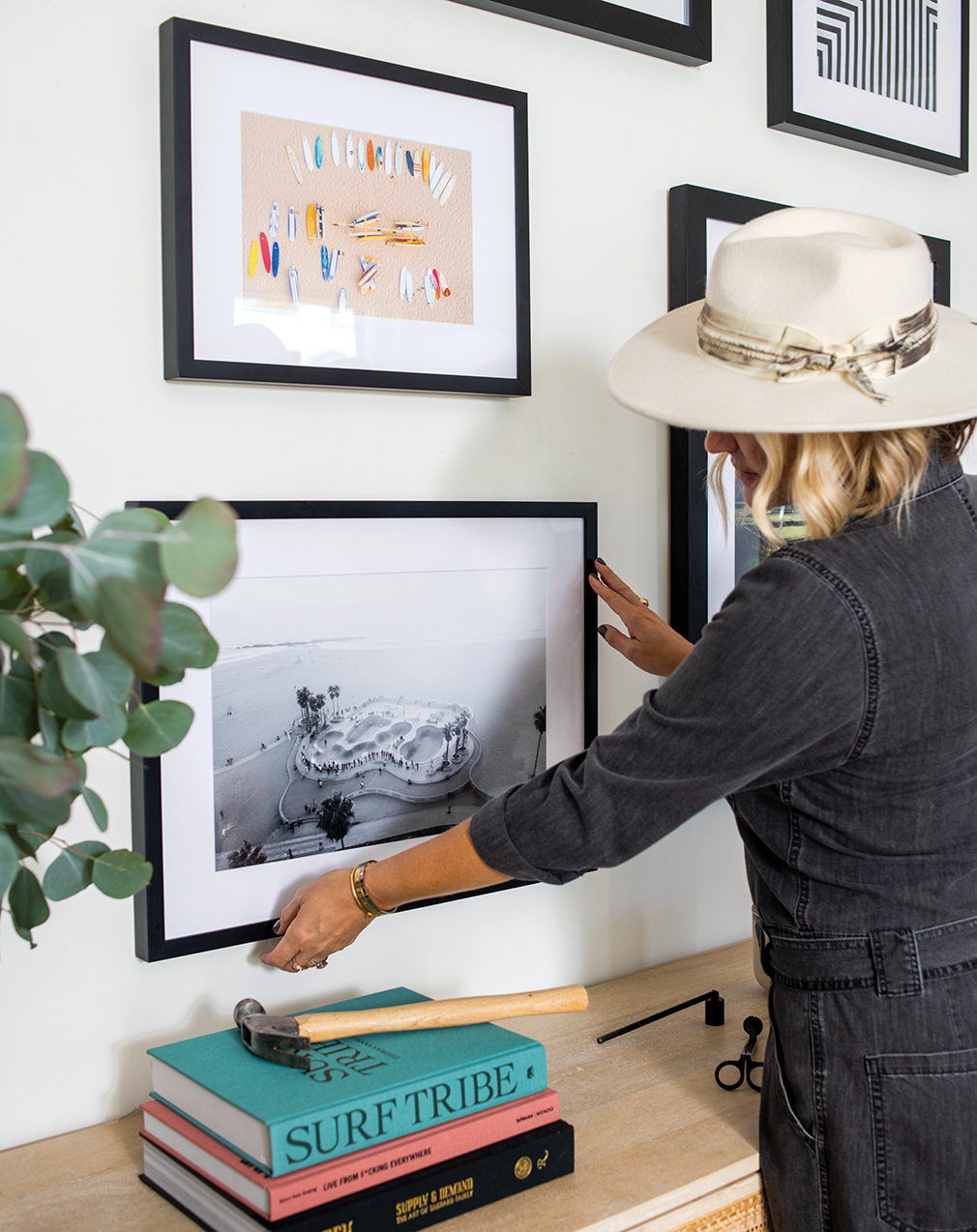
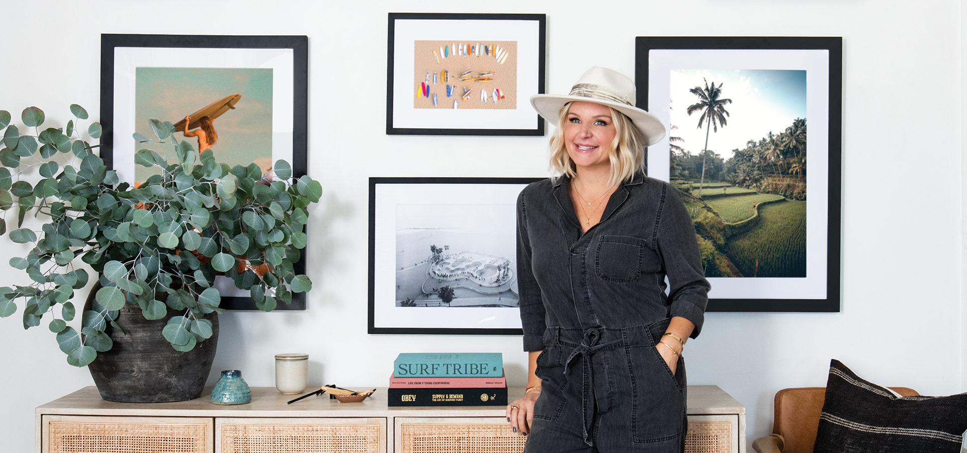
I wanted to create a “California cool” aesthetic with a little edge, so I gravitated toward pieces from Driftward that felt quintessentially California but were maybe not so literal. The black-and-white pieces create a nice juxtaposition to the landscape pieces. I also think it’s important to not get too literal and “themey” when selecting prints and pieces for a gallery wall. If you are leaning toward a certain aesthetic, it’s OK to branch out a little. For me, that meant incorporating the piece of the California desert because, as we all know, the beauty of California is not just in its miles of coastline.
Mix it Up
People tend to stick to the 8×10 or 11×14 realm because that is comfortable. But to create a visually stunning gallery wall, it’s important to have a mix of sizes and shapes. Include at least one large anchor piece and complement that with smaller pieces.

Map it Out
Use brown paper. I know this sounds crazy, but when I am working on a gallery wall, I like to cut pieces of brown craft paper to the size of each piece I want to incorporate. I label them and then tape them on the wall with blue painter’s tape. This way it’s super easy to move them around and rearrange everything until you get the look and layout you like.
Frame Game
If you are going for a more streamlined, tailored look, keep mats and frames somewhat consistent. If you want a more curated or “collected over time” look, mixing mats and frames is the best way to achieve that vibe.
How’s It Hanging?
I am partial to a traditional wire and nail or screw to keep things simple. Also, when installing a gallery wall, make sure you have a level on hand.
Have Fun!
Sometimes our best and most-loved gallery walls have been the ones that were the least symmetrical or balanced. Incorporate things that are meaningful and that speak to you. A perfectly curated gallery wall is all about soul and telling a story about the people who live there!
Are you a design professional like Kate? Join the Driftward Trade Program for 20% off. You can explore the entire collection of transportive art pieces at driftward.com.
Out of Office: Falconer Adam Baz
From bird abatement to interactive community experiences, Adam Baz’s career is definitely for the birds.
Dip Your Toes in One of These NorCal Watering Holes
Jump. Dip. Swim. Repeat.
Get the Latest Stories


