Bibliophiles Will Love This New Spanish Revival-Style Home in Mar Vista
Light, height and plenty of library space.
-
CategoryArchitecture, Design, Homes + Spaces
-
Written byJennie Nunn
-
Photographed byDan Arnold
-
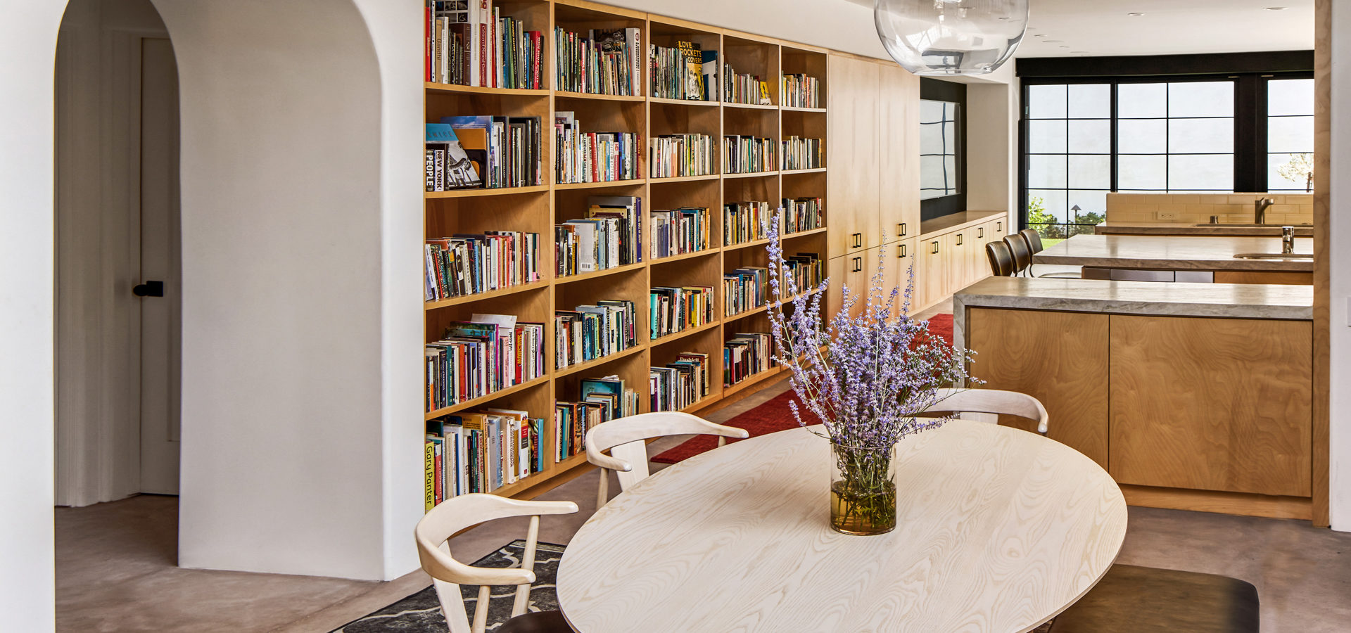
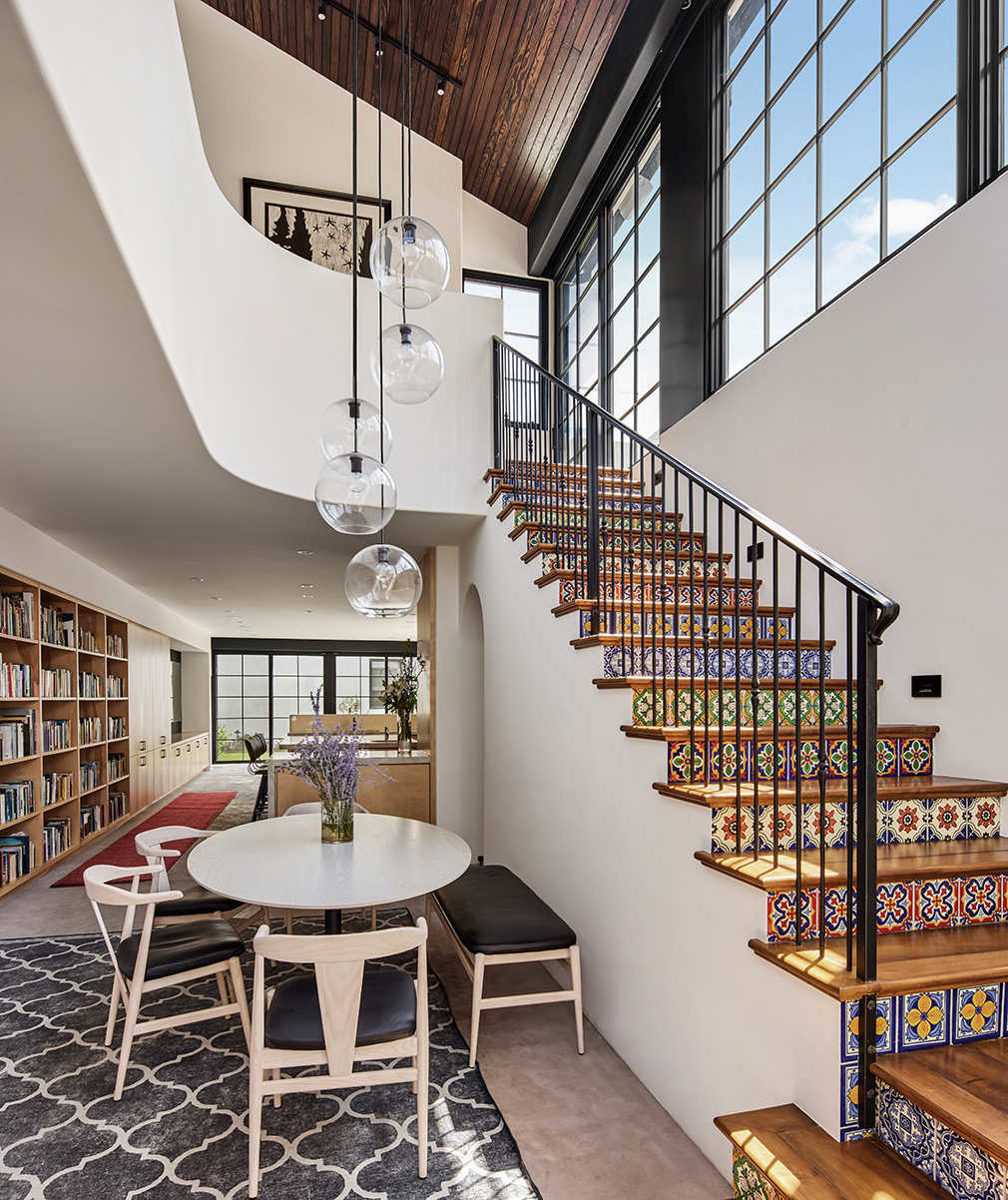
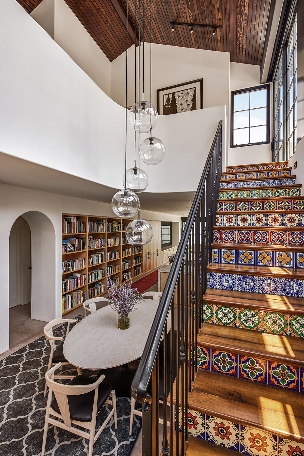
The dining room and built-in bookshelves extending into the kitchen
Above
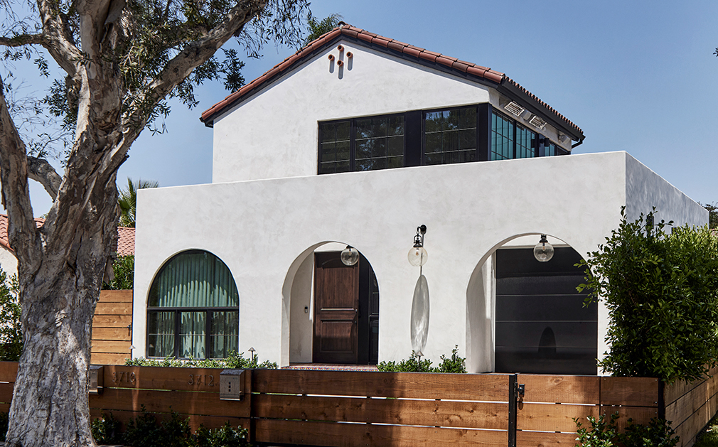
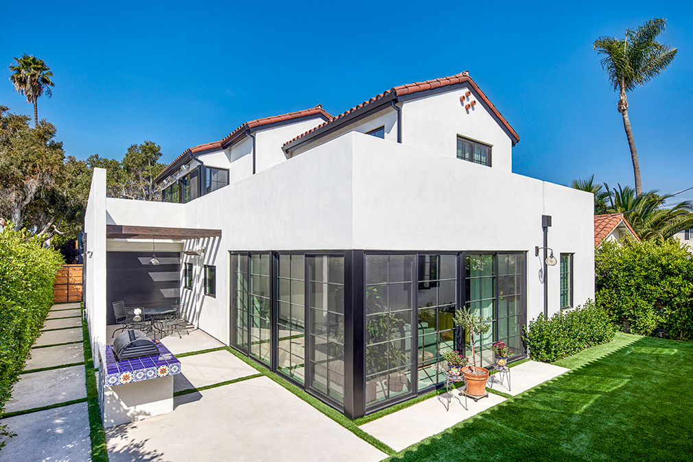
For a Mar Vista couple and their family, all it took was a walk down their own street to inspire a complete overhaul of their home. Thanks to the phone number listed on the site’s marquee, they knew just who to call: Los Angeles–based architect Peggy Hsu, AIA, and designer Chris McCullough of Hsu McCullough. ‘We completed a house on the same street, and the clients lived on the street for a long time,” explains Chris. “They knew the former house [about 10 houses down from theirs], and they watched it go up and saw how it was transformed. They admired its elongated arched windows and crisp, white facade, andwhile they loved the Spanish elements of the other house, they wanted more of a Spanish Revival and an open floorplan.”
The couple’s (he’s a poet and literature professor, and she’s an accounting executive) wish list entailed a designated space for the husband’s extensive book collection, as well as ample room for their three teenage children, their dog, and a separate dwelling for their own parents with a detached accessory dwelling unit, or ADU. “It was a really tired, worn bungalow and the floors were uneven,” says Chris. “It had gone through two or more additions over the years [with some inherent structural problems], and it just made the most sense to tear it down. It’s a true multi-generational home with a one-bedroom ADU for the grandparents. Stylistically, it has all the same features of the main house with the plaster, steel windows, and high ceilings.”
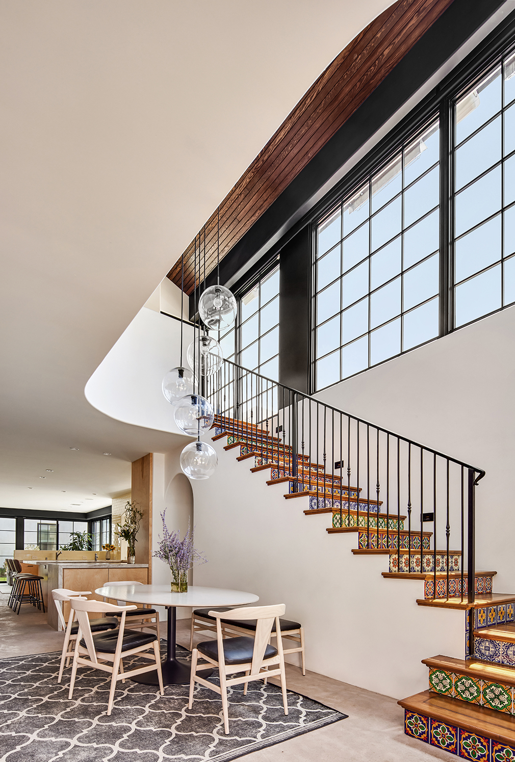
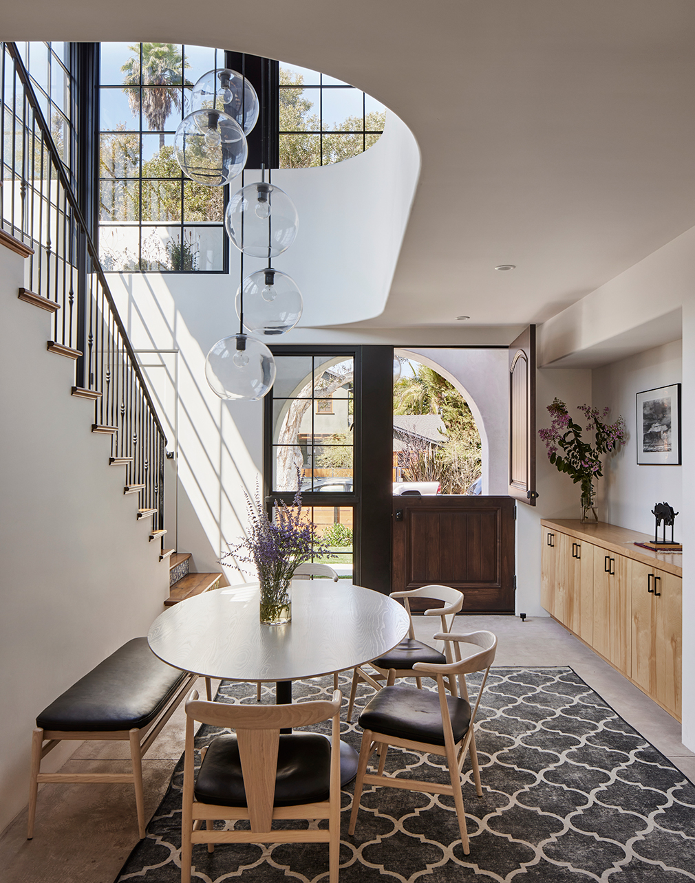
For the 2,508-square-foot main house, the vision was to create a light and bright space with extra storage for displaying books and belongings. They also wanted to add nods to Spanish Revival-style with touches such as Santa Barbara white plaster, a Dutch door, vaulted ceilings, interior arches, curved guardrails, and rich wood floors. “It’s more of a modern Revival with a little bit of midcentury modern [from an LA point of view with the way we did the window bands on the second floor to bring the light in], and the plaster,” explains Chris.
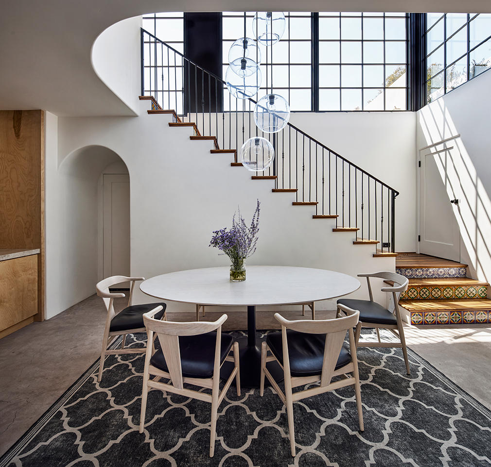
They also added architectural interest with Mexican tile procured from La Fuente Importsand strategically positioned them on the stair risers as well as on the front step entry moment. “We’d done the sort of concrete tile that had been more popular, but we were kind of getting away from that,” says Chris. “We wanted more of the real, authentic style, and we found a vendor in Mexico.”
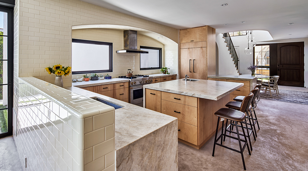
For the kitchen, they adopted a concept of raw, tactile materials including Appalachian Birch wood cabinetry; a backsplash with tile from Dal Tile; sandy-hued stone from Stoneland USA; wrought iron detailing; steel windows; and concrete flooring. “I love that they wanted the books to be a part of their life, and it’s not just this library room that you go to,” explains Chris. “He has a large quantity of books [totaling into the thousands], so it became how to make it fit and be beautiful, but also be a feature. And, we love the idea of it running the Great Room from the entrance to the TV room, and there’s some kitchen pantry along the way.”
The adjacent dining room is appointed with a “Julian” dining table in Ash with sand stain and graphite base from Room & Board; “Evan” chairs and an “Evan” bench from Room & Board. A tiered “Utilitaire” globe shade pendant in bronze finish from Ian K. Fowler for RH hangs above the table and anchors the space.
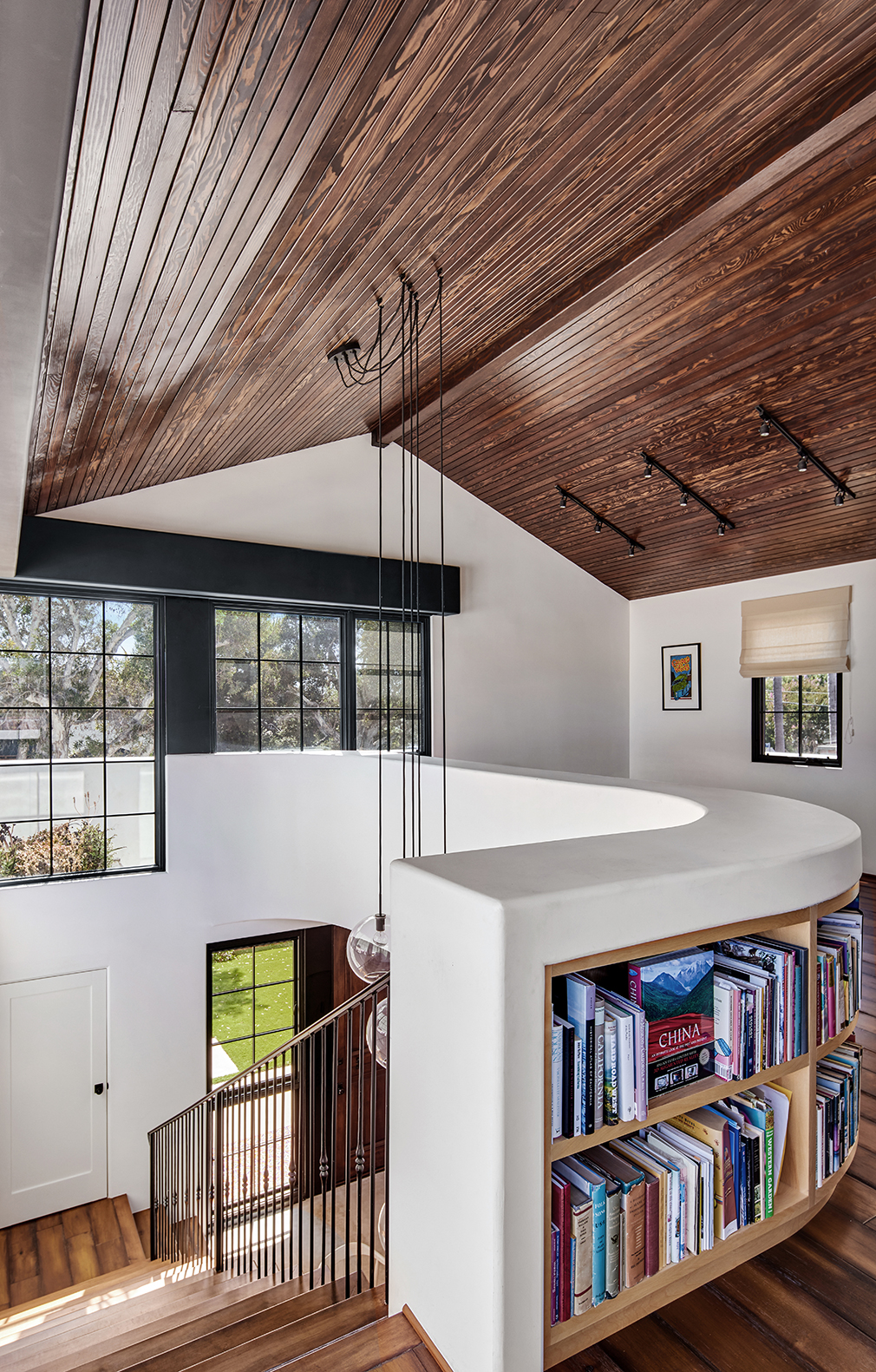
Upstairs, a serene reading room serves as a space for lingering and reflecting beneath a cozy, pine ceiling with a custom Jacobean stain. “The second floor, there was such a big quantity of books we wanted again do it as an architectural statement so we wrapped it around the staircase opening and I think there’s an influence of the famous [American architect] Buckminster Fuller and his own Geodesic dome home,” explains Chris. “He had like a second-floor study, and I’ve always loved that, so we tried to kind of do our own kind of Spanish Revival style version with the custom curved bookshelf into it.”
The finished project is timeless and accommodates all the needs of the family perfectly. “It was such a fun job to work on,” adds Chris. “We love the materiality of Spanish Revival, and we’re not just always trying to be historically accurate. So, it’s a little bit loose so that we can kind of interpret and incorporate some modernism without it feeling too modern, and I love that. It feels like a home versus you’re following a rule book or a playbook. The neatest part is when the client of the first house we did rode his bike past one day, and we chatted, and he told me he was such a fan of this house. For their next house, they want to explore more of a Revival like this. It kind of all came full circle.”
Roy Choi Breaks Bread with Influential Californians to Discuss Future of the Restaurant Industry
Season 2 of Broken Bread debuts January 25.
Google’s New Head of AI Faces a Brave New World
Jeff Dean is so good at his job, his colleagues joke he may be AI himself.
Get the Latest Stories


