A SoCal Interior Designer Doesn’t Hold Back on the Showstopping Design of Her Family Home
Model home.
-
CategoryDesign, Homes + Spaces
-
Written byJennie Nunn
-
Photographed byLauren Taylor
When interior designer Kim Lapin and her husband, Chay, decided to move beyond their city life in Los Angeles to a family home on an idyllic street in Palos Verdes Estates, they knew this was the one. “I didn’t want to move from L.A., but I loved the family vibe of the street that I have always loved,” says Kim, a former model who grew up in Palos Verdes. “It has a magical feel to it. The home had an amazing cozy and warming energy to it when I walked in. It felt like home.”

Although the couple—who have a 2½-year-old daughter and twins on the way—had moved six times in seven years and remodeled several of their own homes, the idea of another major project they could put their stamp was also part of the decision factor. “We love the spontaneity and having another project, and we wanted the house to feel like a creative retreat,” explains Kim. “The original home was Spanish-style on the outside, but the interior felt very heavy with dark paint colors. It had dark, chunky, ornate oak; red-and-cream granite throughout; and heavy wrought iron light fixtures. It felt kind of medieval because of the materials used. Still, I knew I could work with it.”
But Kim, a UCLA graduate and self-taught interior designer, and Chay, who works in commercial real estate, wanted the interiors to reflect their personality and individual style. “I am obsessed with fashion, jewelry and accessories,” says Kim, whose clients once included Target, Speedo and Shape magazine. “I modeled for 10 years and flew all around and shot campaigns in the most beautiful spaces. It chips away and refines your style. You see the best of the best, so you really take time to find the perfect piece. I’m very much into curating and collecting and putting in the effort. It’s worth the hunt, and it doesn’t always need to be expensive.”
To create her vision—with design tenets influenced by one of her favorite designers, Kelly Wearstler—she asked her father, Jack Nelson of Nelson Development, for help with general contracting work. “We didn’t touch the architecture of the exterior, but we changed the buttercream paint color to a warm white and added a muted charcoal trim,” says Kim. “We also removed an unnecessary fountain in the courtyard. We wanted it to feel authentic but modernized.”
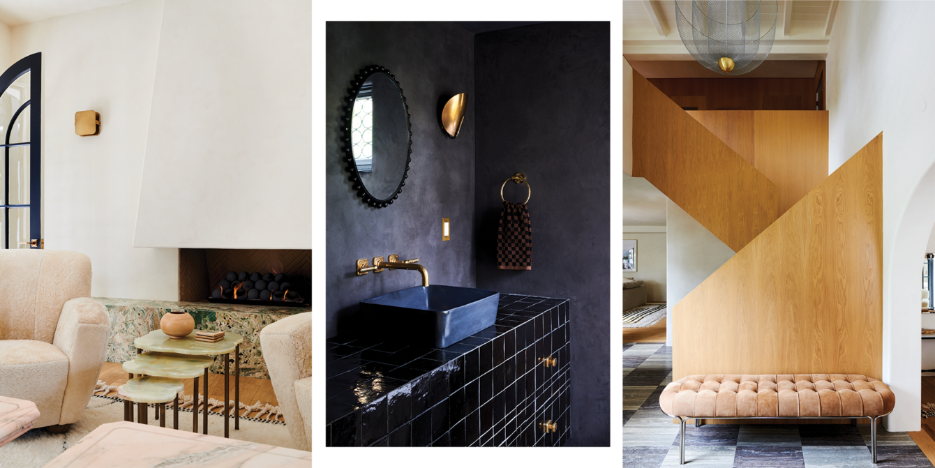
For the major interior overhaul, she chose white oak for a custom staircase and had specific plans for two rooms using her favorite color: pink. In the kitchen, she chose custom white oak cabinets, a pair of Scoop Perforated sconces by Lawson-Fenning, and countertops and stone in Calacatta Vagli Rosato (a type of pink marble quarried in Italy.)
“Pink is my favorite color, and I have always wanted to use this stone in a major way since I laid eyes on it a few years ago,” explains Kim. “I love a veiny, dramatic marble and knew I would want something with more of a statement for a main room like the kitchen. Once I decided on it, it was easy for me to choose pink plaster for the dining room.”
The dining room—appointed with Terra cement plaster by Texston, a Stilnovo chandelier by MM Design, a custom dining table from 1stDibs and chairs by Nathan Lindberg—is undoubtedly one of Kim’s favorite spaces in the house.
“I took it as my opportunity to show how gorgeous and timeless a pink room can be,” says Kim. “I knew it would always make me happy. The kitchen and dining room feel inviting but also fun, and that is always the goal for me. We knew we wanted to use plaster throughout the rest of the house to calm it down. I didn’t want my husband to feel like he’s living in Barbie’s Dreamhouse.”
“Pink is my favorite color, and I have always wanted to use this stone in a major way since I laid eyes on it a few years ago. I love a veiny, dramatic marble and knew I would want something with more of a statement for a main room like the kitchen. Once I decided on it, it was easy for me to choose pink plaster for the dining room.”
In choosing plaster versus other materials, she was able to incorporate an imperfect-like effect throughout. “I like to make choices that feel calming, and with plaster I like that it’s not perfect and pristine,” she says. “Everything that I choose, from the wall finishes to the stone and the lighting, that’s my ‘trifecta.’ I want there to be moments of in-your-face design—like the onyx bench in the sitting room. It’s about showing restraint and making each room have its moment.”
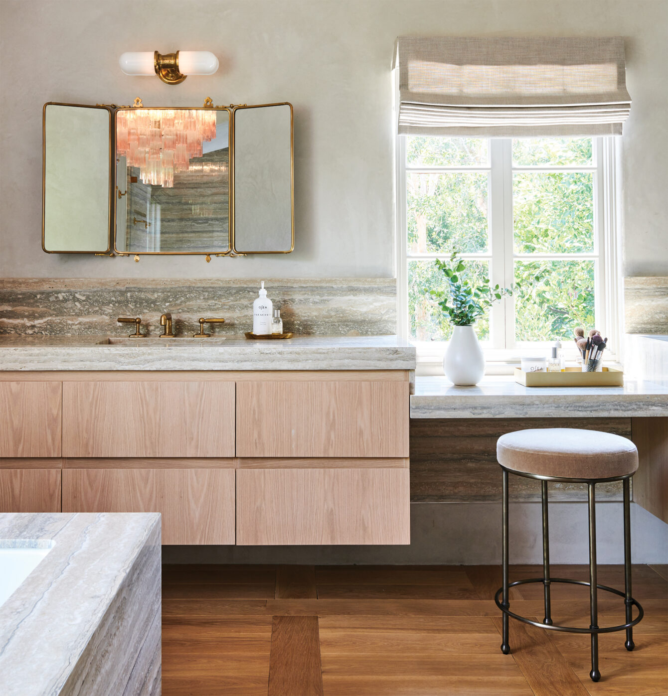
A proponent of vintage lighting, she also strategically sprinkled statement fixtures and focal pieces throughout the home. “One thing I try to do as much as possible is use vintage lighting,” says Kim, who regularly scours Chairish and 1stDibs. “Lighting is my secret weapon because it makes such a huge impact if done well.”
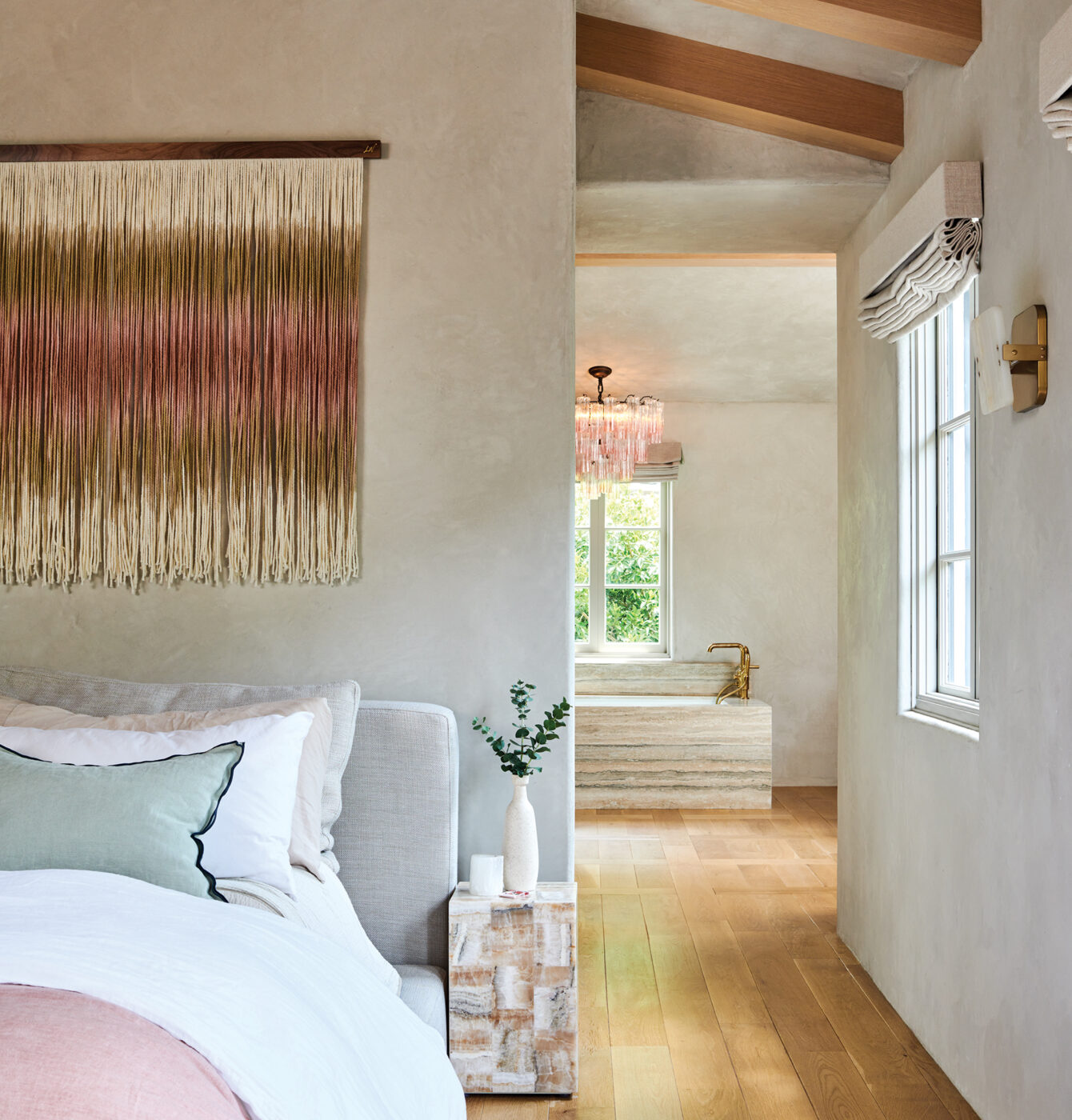
Other jaw-dropping spaces include the hotel- inspired primary bedroom with a Cloud bed by RH and Mercury sconces in white onyx by Arteriors, and the sitting room with a fireplace bench wrapped in Esmeralda onyx, a pair of vintage pink marble tables, a modular sofa by Sarah Ellison and a Kelly chandelier by Gabriel Scott from Twentieth.
“I love to host parties and girls’ nights and wanted a comfy room that also looked chic—like a jewelry box almost—to entertain in with no TV or kid stuff and pretty things to look at when drinking margaritas,” explains Kim. “I imagined a space that was serene but also elevated with interesting shapes, materials and lighting. I had my eye on this Gabriel Scott fixture for a while and knew this was the perfect place to use it. It’s dramatic, gorgeous and interesting. I love how it all turned out because it feels special and a little fancy, but is also cozy.”
Given the time to assess the final result, Kim believes her hard work has paid off. “Every time I come home, I feel like ‘Ooh, I’m home,’ and it makes me happy. It feels like a respite, and it’s the truest representation of what I can do.”
A Living Landmark for Over 70 years, LA’s Main Waterway Is Garnering New Attention
Revitalizing the LA River
Let’s See What April Has in Store for California
The Golden State gets extra colorful this month.
California Hotels Are Adding Cannabis to Their Vending Machines
Cactus Cooler? Nah, I’ll take a vape.
Get the Latest Stories


